How Custom Frame Colors Shape Your Professional Presence: The Psychology and Strategy Behind Eyewear Material Choices
In modern workplaces, personal presentation extends far beyond clothing. Accessories once considered purely functional now carry powerful visual signals that influence perception, communication, and professional confidence. Among these accessories, eyeglasses hold a unique position: they sit at the center of the face, directly shaping how others interpret intelligence, authority, creativity, and approachability.
While many people focus on frame shape or brand name, one overlooked factor often determines the overall impression more than anything else — frame material color.
For professionals investing in custom eyewear, selecting the right acetate or composite frame color is not simply a fashion decision. It is a strategic choice that can subtly influence workplace dynamics, leadership presence, and personal branding.
This in-depth guide explores how customized frame colors interact with psychology, workplace culture, facial structure, and lighting environments to create what many professionals describe as their workplace “aura” or presence.
Why Eyewear Color Matters More Than You Think
Human perception forms impressions rapidly — often within seconds of visual contact. Because eyeglasses frame the eyes, they naturally draw attention during conversations.
Research in visual cognition shows that observers unconsciously associate color cues with personality traits such as:
- Competence
- Trustworthiness
- Creativity
- Authority
- Warmth
Unlike clothing, which changes daily, eyeglasses remain consistent. This consistency makes frame color a long-term visual identity marker.
In professional environments, consistency reinforces recognition and credibility.
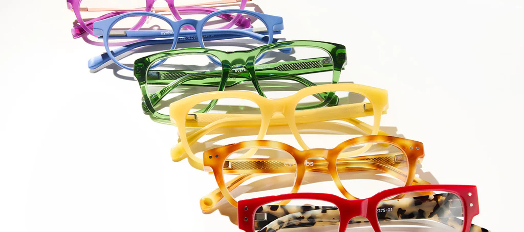
Understanding Frame Materials: Why Acetate Dominates Custom Design
Before discussing color strategy, it’s important to understand why acetate frames are central to customization.
Acetate — a plant-based polymer derived from cellulose — differs from injection-molded plastics in several ways:
- Rich color depth
- Layered transparency
- Hand-polished finish
- Customizable patterns
- Greater durability
Unlike painted frames, acetate colors exist throughout the material, allowing complex visual effects such as gradients, translucency, and multidimensional tones.
This material depth dramatically affects how color communicates under different lighting conditions.
The Psychology of Color in Professional Settings
Color psychology influences workplace perception across industries.
Dark Colors Signal Authority
Deep tones absorb light and reduce visual distraction. They communicate:
- Reliability
- Structure
- Leadership
- Seriousness
Transparent Colors Signal Openness
Clear or translucent frames create softer boundaries around facial features, suggesting:
- Accessibility
- Modern thinking
- Collaboration
Warm Tones Signal Energy
Amber, honey, and warm tortoiseshell shades add vitality and creativity without appearing overly casual.
Cool Tones Signal Precision
Gray, blue, and muted tones communicate analytical thinking and technical competence.
Understanding these associations helps align eyewear choices with professional goals.
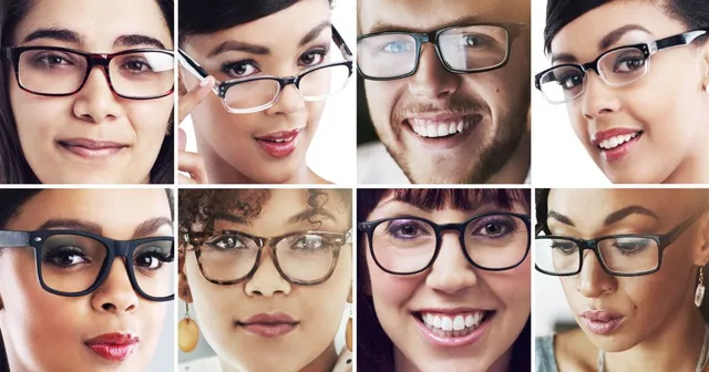
How Frame Color Alters Facial Perception
Eyewear color interacts directly with facial contrast.
Three visual relationships matter:
- Skin tone vs frame tone
- Hair color vs frame saturation
- Eye color emphasis
High contrast creates bold presence; low contrast creates subtle sophistication.
For example:
- Dark frames on lighter skin increase perceived authority.
- Transparent frames soften strong facial features.
- Mid-tone frames balance expressive personalities.
The goal is harmony rather than dominance.
Workplace Archetypes and Ideal Frame Color Strategies
Different professional environments reward different visual signals.
Corporate and Executive Roles
Recommended colors:
- Matte black
- Deep espresso
- Dark tortoiseshell
- Charcoal gray
These tones minimize distraction and reinforce decision-making authority.
Executives often benefit from understated colors that communicate stability rather than trend sensitivity.
Creative Industries
Designers, marketers, and media professionals often succeed with expressive but controlled colors.
Effective choices include:
- Smoke blue acetate
- Olive green
- Gradient amber
- Crystal gray
These colors signal originality while maintaining professionalism.
Technology and Engineering Fields
Technical environments favor clarity and precision.
Ideal tones:
- Transparent gray
- Frosted clear
- Navy acetate
- Cool graphite
These colors reflect analytical thinking and modern minimalism.
Client-Facing Professions
Consultants, real estate agents, and healthcare providers benefit from warmth and approachability.
Recommended palettes:
- Honey tortoiseshell
- Soft brown
- Champagne transparent
- Warm translucent beige
These colors enhance trust and reduce perceived distance.
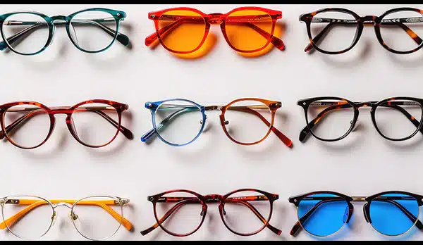
The Science of Light Interaction with Acetate Colors
Office lighting dramatically changes how frames appear.
Fluorescent Lighting
Enhances cooler tones and may flatten warm colors.
Natural Daylight
Reveals depth and layering in acetate patterns.
LED Lighting
Sharpens contrast and increases color saturation.
High-quality acetate maintains visual richness across lighting environments, helping professionals maintain consistent appearance throughout the day.
Transparency Levels: The Hidden Dimension of Color Choice
Frame opacity affects visual weight.
Fully Opaque Frames
- Strong presence
- Clear boundaries
- Formal impression
Semi-Transparent Frames
- Balanced personality
- Contemporary aesthetic
- Reduced facial harshness
Fully Transparent Frames
- Minimal visual interruption
- Intellectual and modern associations
- Ideal for collaborative roles
Transparency often matters as much as color itself.
Custom Layered Acetate: Engineering Visual Depth
Premium custom frames frequently combine multiple acetate layers.
Examples include:
- Tortoiseshell over clear base
- Dual-tone laminations
- Gradient edge coloration
These techniques create movement and depth, making frames appear refined rather than loud.
Layered colors subtly shift depending on viewing angle, adding sophistication without overwhelming professionalism.
Matching Frame Color to Personal Branding
Professionals increasingly cultivate consistent personal branding across:
- LinkedIn photos
- Video meetings
- Public speaking appearances
- Social media profiles
Eyewear color becomes part of that visual identity.
Consistency strengthens recognition and memorability.
When people remember your face clearly, communication becomes easier and trust builds faster.
Virtual Meetings and Camera Perception
Remote work has introduced a new factor: webcams.
Certain frame colors perform better on camera.
Camera-Friendly Colors
- Medium contrast tones
- Soft matte finishes
- Neutral translucency
Colors to Use Carefully
- Pure white (overexposure)
- Highly glossy black (reflection glare)
- Neon tones (color distortion)
Custom frame selection should consider digital presence as much as in-person interaction.
Gender-Neutral Color Strategies
Modern professional environments increasingly favor inclusive aesthetics.
Neutral acetate tones work across styles and identities:
- Warm gray
- Soft olive
- Light tortoise
- Clear smoke
These colors emphasize professionalism over traditional gender cues.
Emotional Impact on the Wearer
Frame color influences not only how others perceive you but also how you perceive yourself.
Psychologists call this enclothed cognition — the phenomenon where appearance affects behavior.
Professionals often report:
- Increased confidence with darker frames
- Greater creativity with expressive colors
- Calm focus with neutral tones
When eyewear aligns with internal identity, performance often improves naturally.
Common Mistakes When Choosing Frame Colors
Following Trends Blindly
Fashion colors change quickly, but glasses remain daily essentials for years.
Ignoring Workplace Culture
A bold color suitable for design studios may feel distracting in finance environments.
Overmatching Skin Tone
Too little contrast can make frames visually disappear, reducing presence.
Choosing Based Only on Online Photos
Lighting differences make in-person evaluation essential.
Seasonal Adaptability and Long-Term Wear
Unlike clothing, eyewear should transition seamlessly across seasons.
Balanced tones — neither overly warm nor overly cool — maintain versatility year-round.
Neutral layered acetate often provides the best longevity.
Maintenance and Color Longevity
Quality acetate preserves color depth longer than coated plastics.
To maintain appearance:
- Clean with microfiber cloths.
- Avoid prolonged UV exposure when not worn.
- Store in protective cases.
- Avoid harsh chemical cleaners.
Proper care keeps color clarity intact for years.
The Rise of Fully Customized Frame Color Design
Custom eyewear studios now allow clients to select:
- Base acetate sheets
- Layer combinations
- Edge polishing styles
- Transparency ratios
This level of customization transforms glasses into personalized design objects tailored to both facial structure and professional identity.
Future Trends in Professional Eyewear Color
Emerging developments include:
- Bio-based colored acetates
- Adaptive tint materials
- AI-assisted color matching
- Environment-responsive finishes
Customization is shifting from luxury feature to expected standard.
How to Choose Your Ideal Professional Frame Color
A practical decision framework:
- Identify workplace expectations.
- Define desired professional impression.
- Evaluate facial contrast balance.
- Test under multiple lighting conditions.
- Consider camera appearance.
- Prioritize long-term versatility.
The right color should feel natural rather than forced.
Final Thoughts: Color as Quiet Communication
Your eyeglasses speak long before you do. Without saying a word, frame color communicates confidence, creativity, authority, or warmth.
Custom acetate color selection is not about standing out unnecessarily — it’s about aligning visual presence with professional intention.
When chosen thoughtfully, the right frame color enhances facial harmony, strengthens personal branding, and subtly shapes how colleagues and clients experience your presence.
In the modern workplace, professional impact often lies in small details executed well. Custom frame color is one of those details — quiet, constant, and surprisingly powerful.
Your glasses are not just tools for vision. They are architectural elements of identity, framing not only how you see the world, but how the world sees you.
Leave a Reply
You must be logged in to post a comment.